Frequency Plot Example
a3_FrequencyPlotExample.RmdFrequency plots are commonly used in copy number analysis in bulk sequencing studies to show how frequently different regions of the genome are altered. A similar approach can be done in single cell data by pseudobulking the cells and then thresholding the values to label each region as a loss or gain for the pseudobulked values.
By default, the makeFrequencyPlot() function will group
all cells based on their sample of origin (or whatever metadata column
is provided to the group parameter) and take the mean copy
number value for that group at each genomic bin. It will then perform
thresholding to label regions as loss/neutral/gain. As a primary
example, we can begin with the example data and use the default values
for the function.
library(scCNVis)
#Create object using provided example data
obj <- scCNVis::createPlotObject(example.matrix,
                                 example.cells,
                                 example.granges,
                                 example.meta)
fp.result <- scCNVis::makeFrequencyPlot(obj)

#scCNVis::saveCustomPlot(fp.result, "~/path/to/plot.png")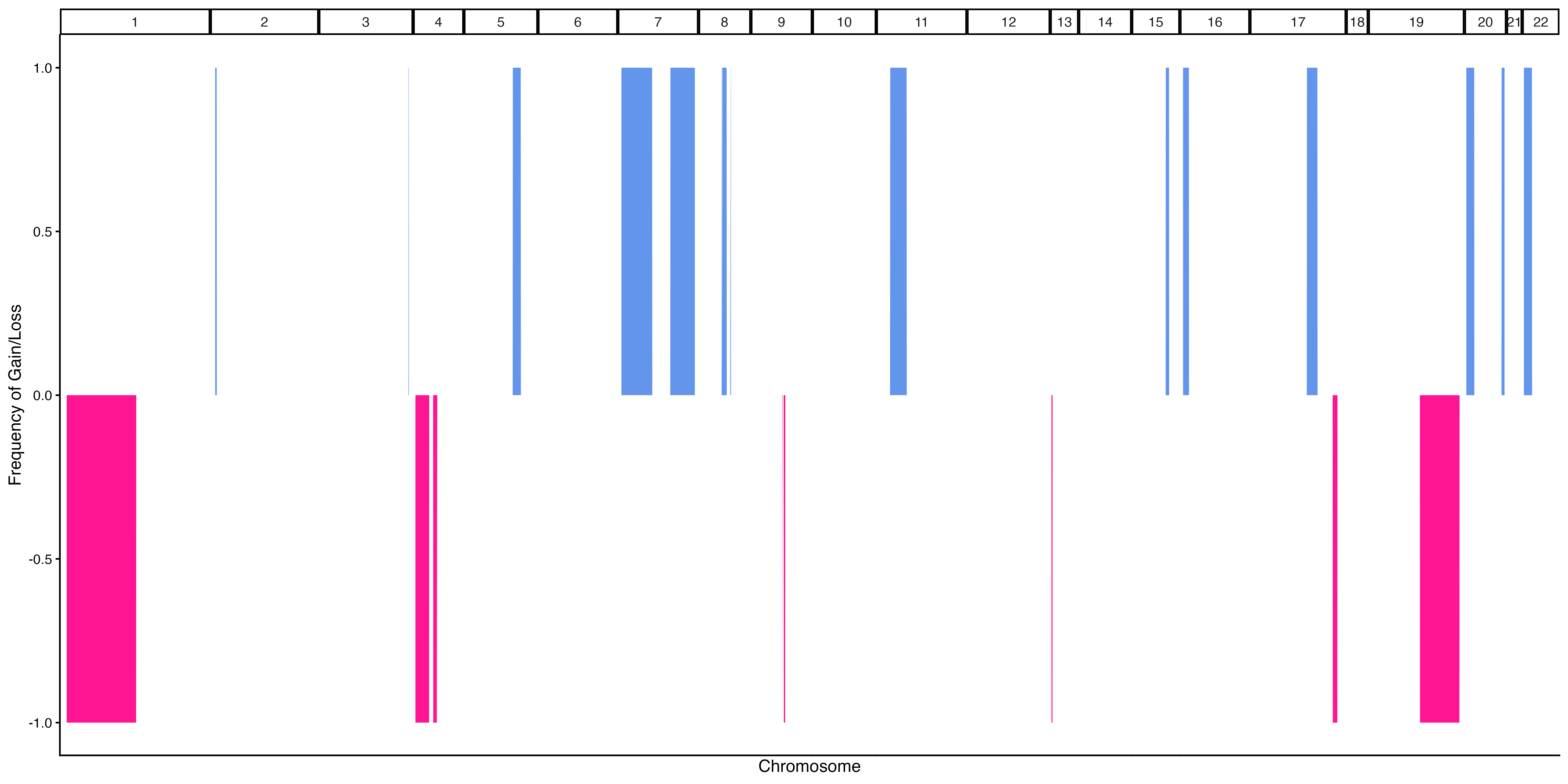
Example 1a. Frequency Plot
As with standard frequency plots, colored regions above 0 indicate that a percentage of our pseudobulked samples have gains in those regions, while colored regions below 0 indicate that a percentage of our pseudbulked samples have losses in those regions. Since our example only has 1 sample, you can see that all values are 0% or 100%.
While the default above is the standard use for a frequency plot,
makeFrequencyPlot() includes some additional features that
may help provide additional insights. For example, the pseudobulked
values do not necessarily have to represent samples. In the below
example, they represent subclones from out metadata. The below example
also shows how users can provide custom filtering thresholds to define
gains and losses and how to color those values with custom colors.
#Defining a custom thresholding function
#The function will be passed a data.frame with the following format
#Columns: "chrm" "middle" "pos.index" "name" "value"
#Where chrm = seqname from obj@GRanges
#      middle = Middle of genomic position (bp)
#      pos.index = Numerical index of row
#      name = Name of sample (or other pseudobulked group)
#      value = Copy number value for the pseudobulked group for this region
#The output of the function is expected to be the a data frame
#that includes these same columns, although this is explored
#further in a later example
custom.data.func <- function(data) {
      sd.value <- sd(data$value, na.rm = TRUE)
      mean.value <- mean(data$value, na.rm = TRUE)
      #Any value > mean + 0.5sd will be considered a gain
      data[data$value > mean.value + (sd.value * 0.5),"value"] <- 2 #Gain == 2
      #Any value < mean - 0.5sd will be considered a loss
      data[data$value < mean.value - (sd.value * 0.5),"value"] <- 0 #Loss == 0
      #All other values will be considered neutral
      data[data$value != 2 & data$value != 0,"value"] <- 1 #Neutral == 1
      return(data)
    }

fp.result <- scCNVis::makeFrequencyPlot(obj,
                                        group = "Subclone",
                                        data.func = custom.data.func,
                                        gain.color = "green",
                                        loss.color = "purple")

#scCNVis::saveCustomPlot(fp.result, "~/path/to/plot.png")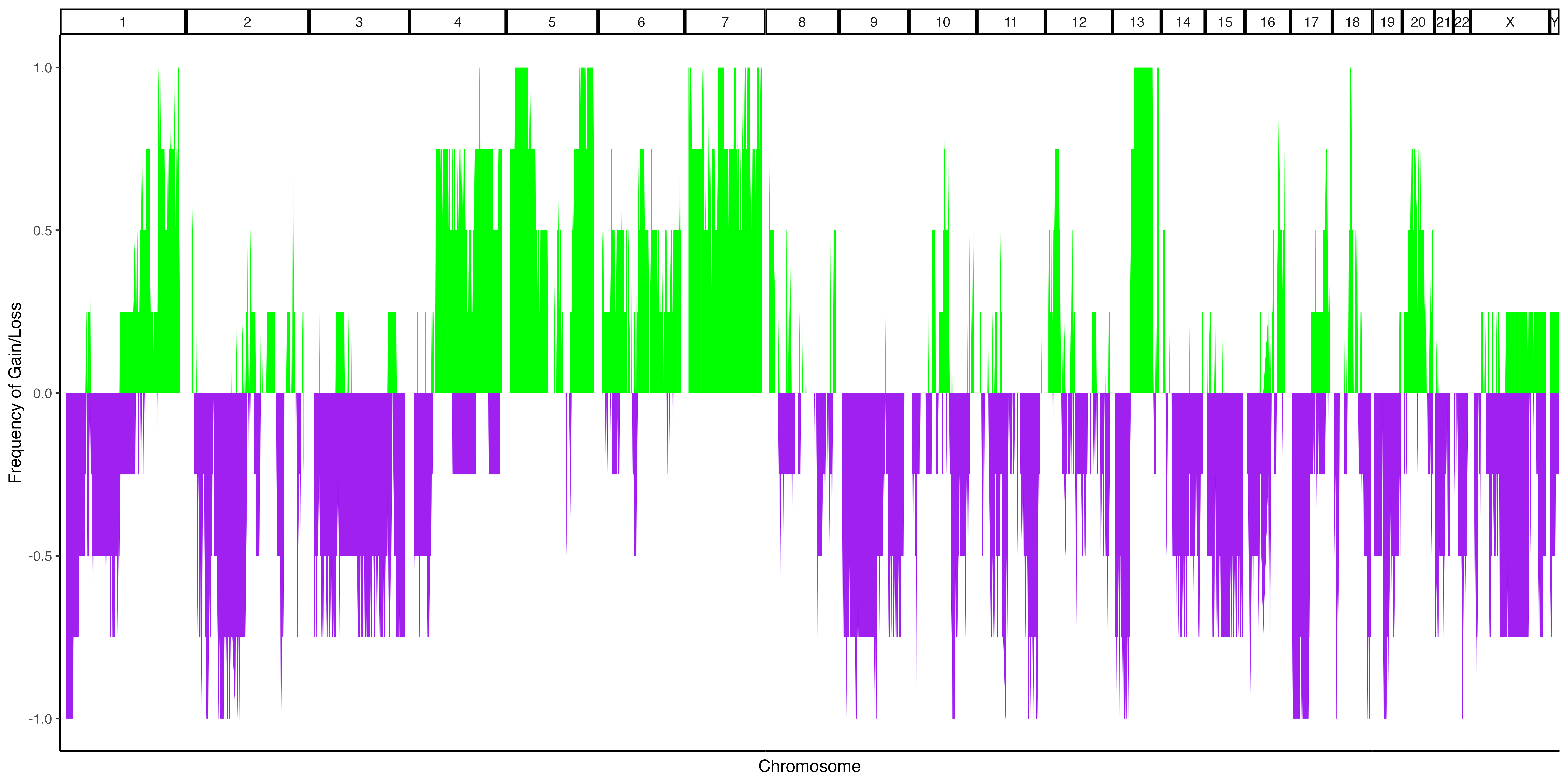
Example 1b. Frequency Plot, pseudobulked subclones
As our data had 4 defined subclones, we can see that the available values in our frequency plot are now 0%, 25%, 50%, 75% and 100%. We can observe that 100% of our subclones had loss on parts of chr1 and chr19, while only half of them had loss on chr4.
In some cases, it may be desirable to group values together. In the below hypothetical example, we will pretend that each of our subclones represent a sample, and that two of those samples have Phenotype A and two of them have Phenotype B.
new.meta <- obj@Meta

#Pretend that subclones represent samples, and assign phenotypes to those samples
new.meta$NewSample <- new.meta$Subclone
subclone.names <- unique(obj@Meta$Subclone)
new.meta$NewPhenotype <- ifelse(new.meta$Subclone == subclone.names[1] |
                                  new.meta$Subclone == subclone.names[2], "Phenotype A", "Phenotype B")


#Add the hypothetical metadata to our scCNVisObject
obj <- scCNVis::addMetaData(obj, new.meta$NewSample, "NewSample")
obj <- scCNVis::addMetaData(obj, new.meta$NewPhenotype, "NewPhenotype")

#Frequencies are calculated by 'NewSample' and 'NewPhenotype' groupings
fp.result <- scCNVis::makeFrequencyPlot(obj,
                                        group = "NewSample",
                                        secondary.group = "NewPhenotype")

#scCNVis::saveCustomPlot(fp.result, "~/path/to/plot.png")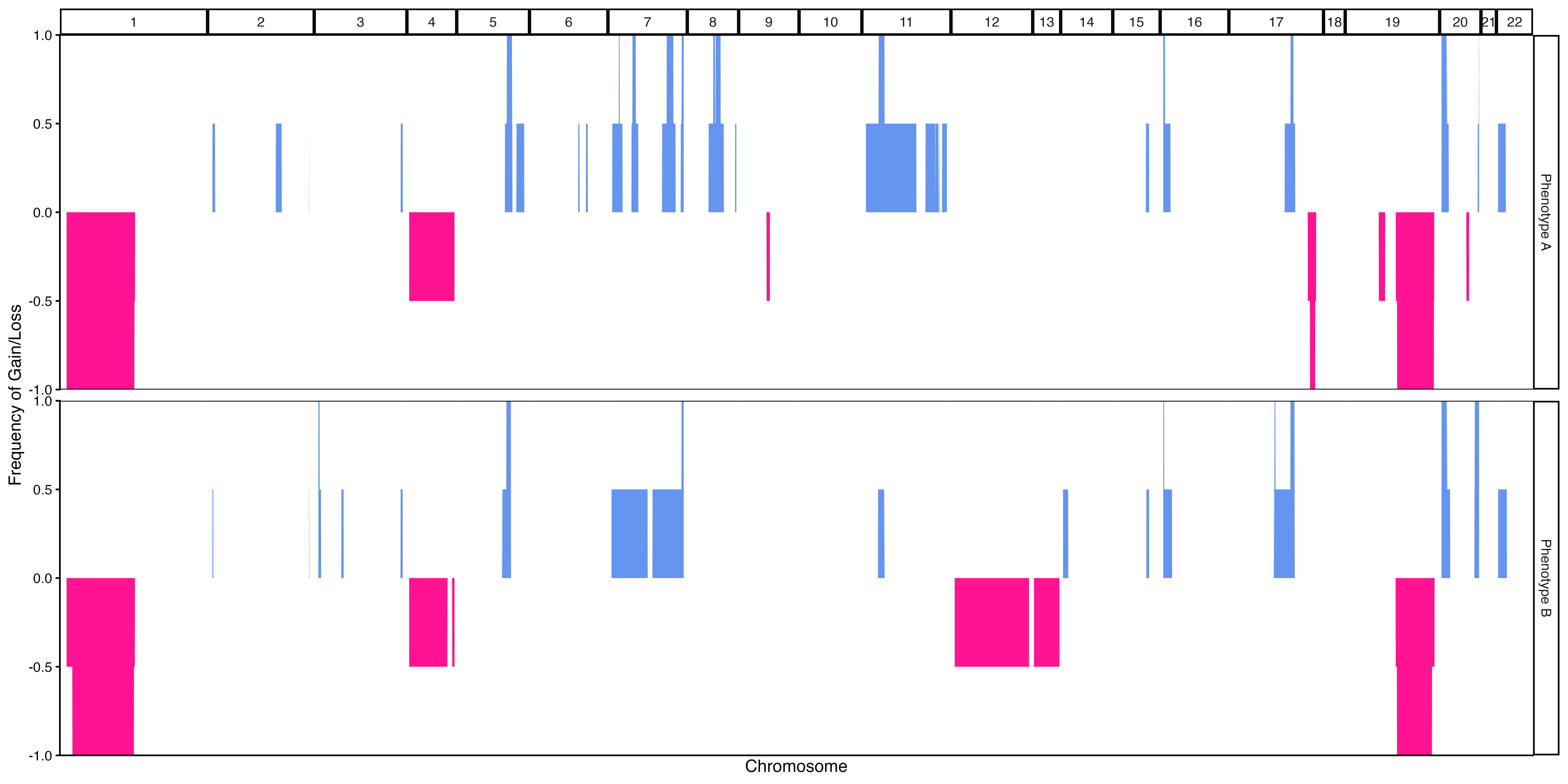
Example 1c. Frequency Plot, pseudobulked subclones grouped by arbitrary phenotype
Our results are now grouped by phenotype. Since each (arbitrary) phenotype had two hypothetical samples assigned to them, we see that all values are either 0%, 50%, or 100%. We can observe that losses on chr12 are only found in Phenotype B, while all “samples” that have Phenotype A appear to have a focal loss on chr17.
Finally, like the makeLinePlot() function, the output
plot is a ggplot object, which means that users can freely alter the
output like they would a standard ggplot figure. Additionaly,
fp.result$PlotData contains the data.frame used to generate
the plot, so users can create the plot from scratch if they desired. An
example of this customization is shown below.
fp.result <- scCNVis::makeFrequencyPlot(obj)

#I have selected a random gene/location here, but manual inspection
#of fp.result$PlotData can be done to find the "pos.index" value
#that overlaps with the location of genes of interest and used to add
#marker gene labels
pos.index.example.values <- c(300, 7950)
marker.gene.names <- c("GeneA", "GeneB")

final.plot <- fp.result$Plot +
  ggplot2::scale_x_continuous(breaks = pos.index.example.values,
                              labels = marker.gene.names) +
  ggplot2::labs(x="Genome",
                y="Frequency of Alteration",
                title="Genome Alteration Frequencies") +
  ggplot2::theme_bw() +
  ggplot2::theme(panel.spacing.x = ggplot2::unit(0.1, "lines"),
                 panel.spacing.y = ggplot2::unit(1, "lines"),
                 plot.title = ggplot2::element_text(hjust = 0.5))

#fp.result$Plot <- final.plot
#scCNVis::saveCustomPlot(fp.result, "~/path/to/plot.png")
#or simply ggplot2::ggsave(final.plot)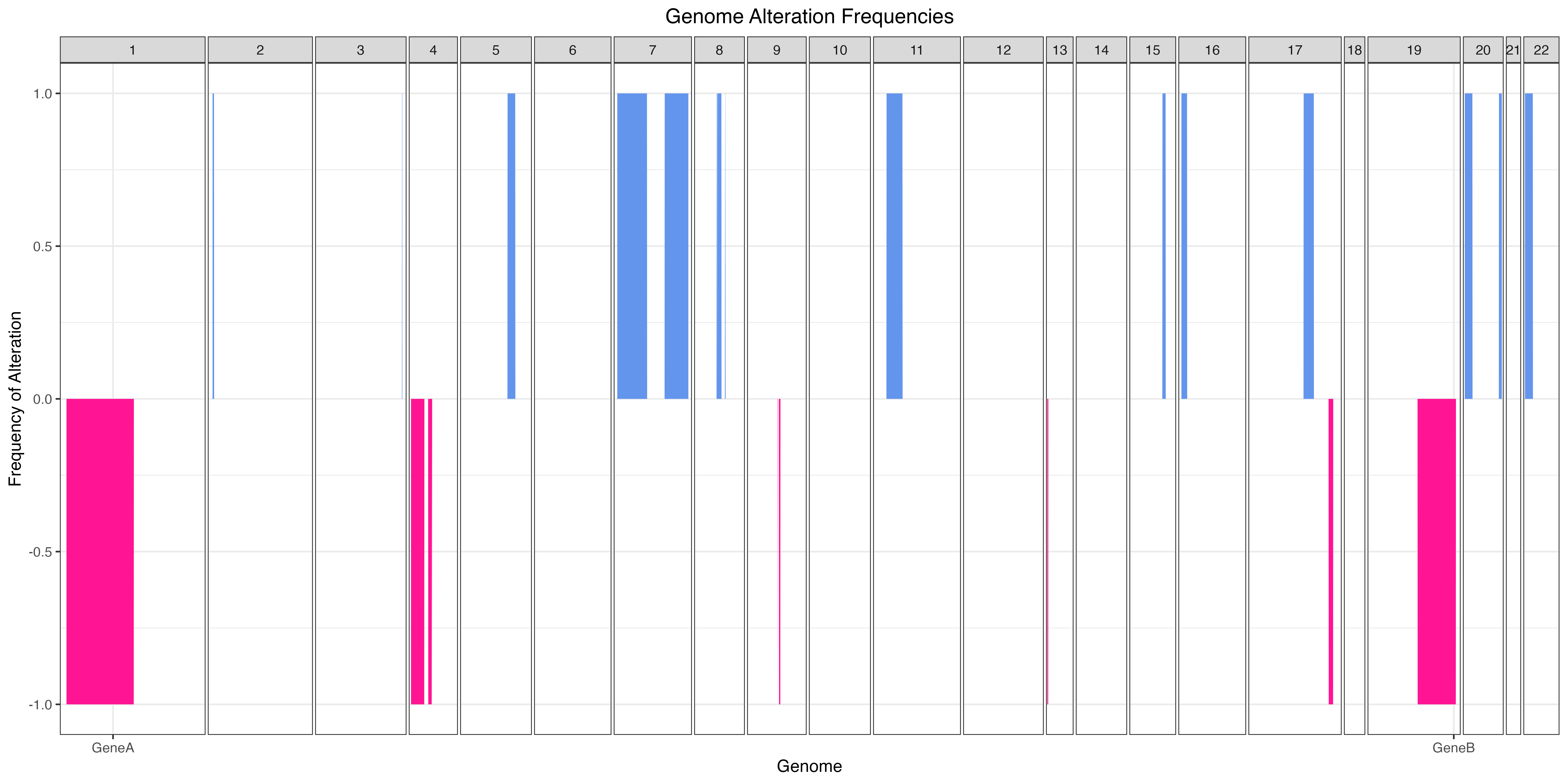
Example 1d. Frequency Plot with customization